Swan

Artwork, Design

I have a post all written and ready to go…I just don’t have the image ready yet. I finally had time tonight to the get the image all set up, only to realize that I can’t open it with my program because it’s too old (my program, not the image). Boo! Next week, the mystery post will go live…with an image! Whoo hoo!

Instead of what was currently planned, you get…a swan! Why a swan, you ask? Well, let me tell you. I was searching through my files to see if I had anything good to post that you haven’t already seen, and I came across this swan. It was a stock photography image that I vectorized. (Is that a word? Probably not, but I’m sticking with it!) The picture was so beautiful, and I wanted to see if I could recreate it in Illustrator, and I could. Hooray! I was really pleased with how it turned out because it looks really close to the original photograph.

Being trained in prepress, I see a lot of people using fun effects that don’t always end up printing correctly and cause a bunch of headaches. So it’s really rare that I use many effects. But since this isn’t ever getting printed, I used a blur. Yeah, I’m a rebel. Watch out!

Swan

Wellspa MN

Design

Remember that post I was telling you about last week that was all ready to go except for the image? Well this is it. Enjoy!

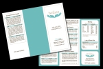
This image is a brochure that I designed for Wellspa MN. You can check them out at www.wellspamn.com. Creative Graphics has been doing business with the owner, Mary Haas, since before I started working there. She used to own a photography business and has recently opened up a wellness spa.

Mary is great to work with. She really values creativity and has a lot of great ideas herself. She also really lets you know how much she appreciates what you do. Ahhhh, if only there were more Marys in the world!

I did a couple of designs for her. One was similar to this one, but without the teal solid. (From working with her previously, I know that she really likes simple designs.) But after I had put the solid color on the screen, I really fell in love with it and had to add it as a sample. Not that the other design was bad, it just needed a little something. Luckily, she liked it too!

The rounded edges in the border match her business cards that I previously designed for her. We rounded two of the opposite corners, so the border is a mirror of that. A fun design to work on, and I’m pleased with how it turned out.

wellspamn_brochure

Logo Design

Design

Last week was quite a hectic week. I was the only one in the prepress department at work, and customers decided they needed printing, and they needed it now! It got to be too much work for one person, so I ended up getting a lot of extra hours in (can’t complain about that! Especially when I get my check!).

It was also a little hectic in my personal life as well. We had a midweek game of Battlestar Galactica so that one of our friends could play the game for the first time. And I had an early morning 8 mile jog planned with my best friend. (I didn’t make it the full 8 miles, by the way. But I was able to go 5! Yea!) Not to mention all the hours I’ve been logging on my painting…

What all of this is leading up to, is that I meant to post these logos sooner. So here they are. These are some logos that I designed at work for a Realtor. He wanted a logo for his tagline that he can add on to all of his business ephemera. At first, this project was a little daunting because there are so many logos out there for Realtors that use a house or a key. I was afraid it would be hard to come up with something that wasn’t cheesy. I think I managed to make obvious what it was and still keep it looking sophisticated. The final copy, the art that the customer chose, is the square house with line drawing roof over the top, in the tealish-blue color. This was honestly, my last choice (the taller house with the outlined roof), but after he told me the tweaks he wanted made to it (the shorter house with the words Key and Home emphasized), I think it looks much nicer.

ryan_ness_logo1ryan_ness_logo3ryan_ness_logo2ryan_ness_logo4ryan_ness_logo5

Progress

Artwork

I’m not sure if you remember, but awhile back, I did a post on a painting that I am working on for one of my friends. With moving and updating my website, I really didn’t have a lot of time to work on it. Now though, I have all the time in the world! I actually spent most of my weekend on it. It’s going well. I have almost everything blocked in. The humidity has not been my friend though, and the paint is taking longer to dry than what it should, but it’s been fun to see it progress.

I have to apologize for the close up picture. I had planned on posting a full picture, but then my husband alerted my friend to my blog, and there is a possibility that she may visit and see her painting before it’s ready. I want it to be a surprise, so I’ll have to post the progress after she’s seen it. (Good thing I didn’t post this earlier, huh?)

docs_painting

Mystery Art

Artwork

Last Friday, my friend from work and I took a Mystery Art Class through the Eagan Parks and Rec. I was really excited because I had never taken this class before, and the description sounded fun! We would show up at the Eagan Art House for a night of creating art, wine, and light refreshments. How could that not be great?!

It was fun, but it was nothing like what I expected. I thought we would paint, draw, create pottery, do a mosaic or something like that, where we would end up with a finished product to show off to our friends and family. And maybe even be exposed to some art medium I’d never used before.

Instead we played a game. It was a mash up between Apples to Apples and Pictionary. This is how the mash up worked. The instructor pulled out a green card that had an adjective on it. The participants (that was the group I was in 🙂 ) were given seven red cards that had a noun on them. We had to pick the noun that we thought best described the adjective that the instructor had chosen. Then we had to draw our adjective. We were given anywhere from 1 to 10 minutes to draw our cards. I think most of us were a bit panicked that we wouldn’t be able to finish in time, so we all drew really fast and didn’t get more than 5 minutes after our initial 10 minute time limit. But 5 minutes was more than enough time to get a general idea across.

I thought it was a very inventive idea, and it made Apples to Apples more fun for me, since I’m really not a big fan of that game. I think I would have liked it even more if I were playing with people that I knew, instead of a room full of strangers. I had some cards that would have been funny to me and my friends, but to people who don’t know me and don’t know that I like to joke around, I could have offended someone. Not that I’ll probably ever see any of these people again, but I don’t like to offend people unless I’m trying to. And it’s pretty rare that I ever try to.

I got stuck with some pretty difficult cards the first round. I had Steve Martin, Celine Dion, and Cher. Luckily, nobody had to guess who it was that I had drawn!

So even though it was not what I had expected, I did have fun, and I’m glad that I went. But I don’t know that I’ll be going back again.

mystery_art