2021

Artwork, Design, Miscellaneous
colored sketch of happy cat on back

2020 is finally over! What a strange year it was. And a long year. I’m hoping 2021 will be better, but it didn’t get off to the best start. But as the month has progressed, it’s calmed down a bit. So that’s good!

Looking back at my year, I was really fortunate. I was able to keep my job and work from home. I got to see my Grandma before she died, and I have some really good memories from that. And Nick and I have proven we are capable of inhabiting the same space for really long amounts of time and not murder each other!

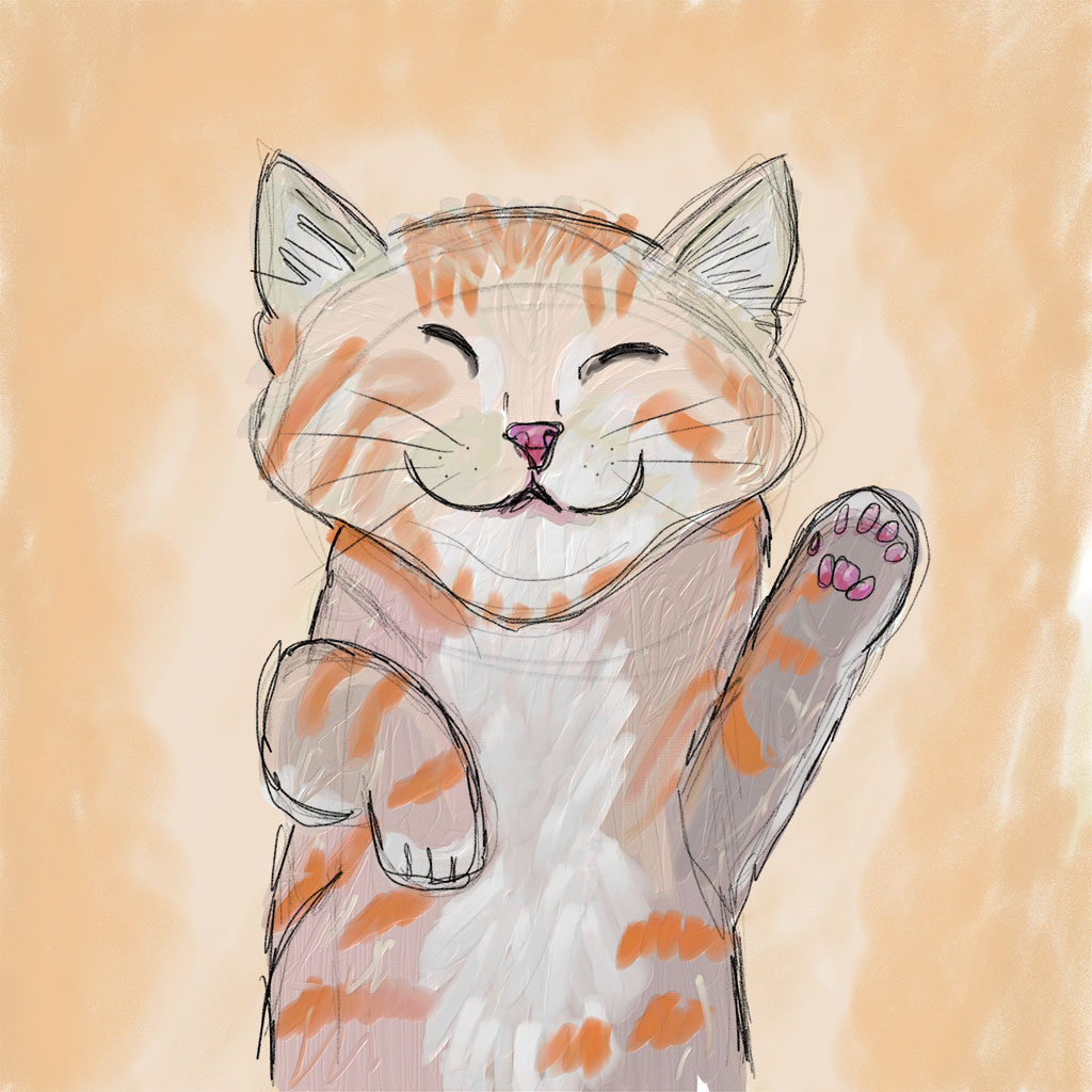
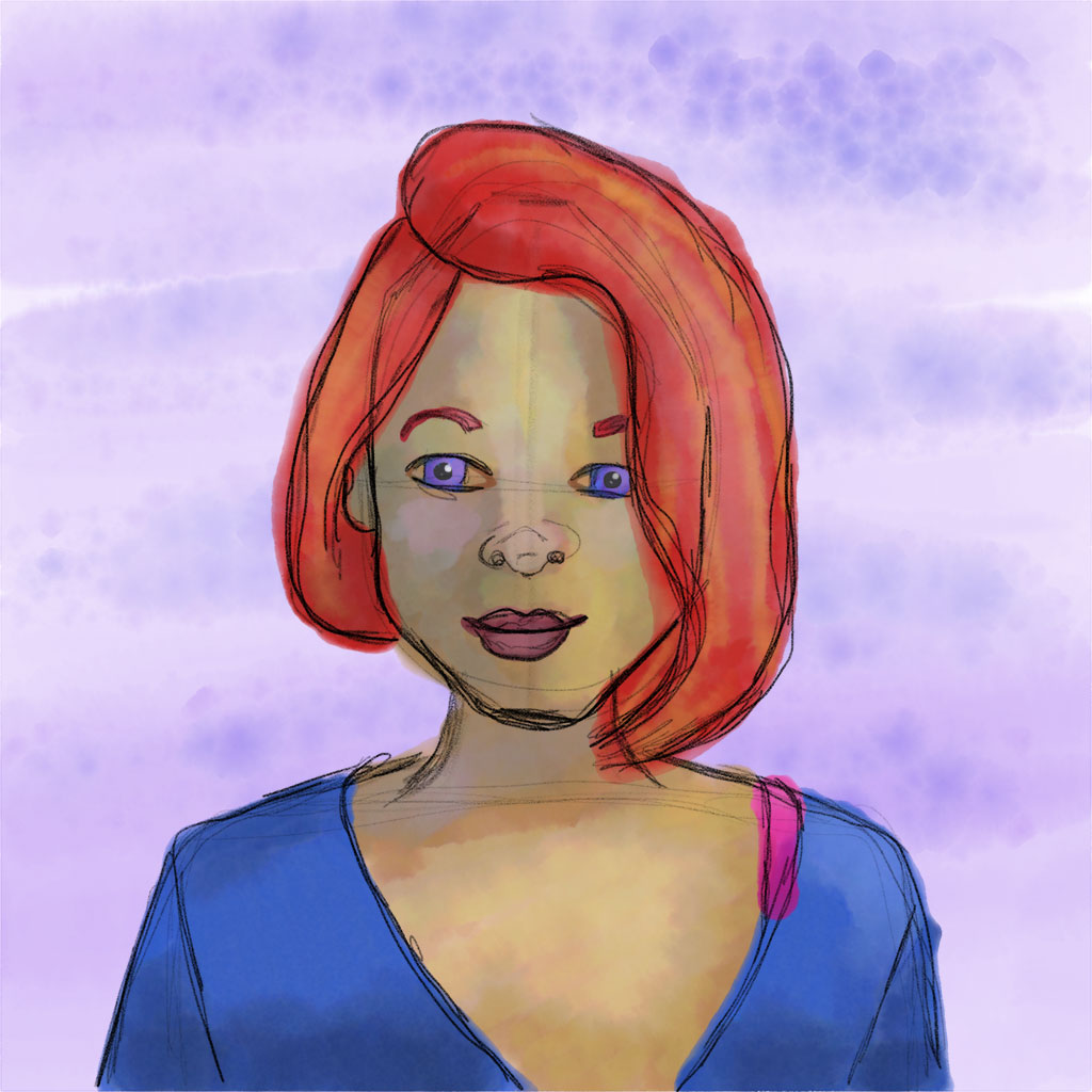
There were some bad moments too, of course, but overall, I tried to stay positive. When the pandemic first started, I honestly didn’t think it would last for as long as it has. I tried to keep my schedule relatively the same, so that I could jump right back in to my normal life, as soon as we all got back into it. And I tried to see the opportunities that it was giving me. I drive a long way to work, so I gained extra time every day! The extra time gave me more time to do the things I’ve been wanting to do. Practice guitar daily! Draw more! Extra time to blog more! Run longer distances! Extra time to treat myself by doing face masks, painting my nails, and relaxing! And extra time with Nick!

Unfortunately, as time has moved on, I have adjusted for this to now be my normal. I don’t get up as early as I used to. I have spent more time in front of the TV than I have in years. I’m not practicing guitar as much. I’m not blogging much. I’m sitting around more, and my running mileage has not progressed at all.

But it hasn’t all been bad. I’m almost finished painting our Last Night on Earth Hero game figures, which has been on my list of things to do for awhile now. I’ve started knitting again, which I haven’t done in forever. I have been taking more time to focus on me. I’ve gotten to play more video games. And Nick and I have tried to come up with fun and creative things to keep our days from becoming mundane (we have formal Fridays, had a coffee date on the porch, set up a photo booth, had a cultural fest, and our very own version of GenCon!).

The biggest takeaways I got from 2020 are that exercise is very important for me, it’s ok to relax and not feel guilty about it, and yes, I am definitely an introvert!

I always knew that exercise was important to me, but I guess I thought it was more of a want than a need. But as it got colder outside, and I kept indoors more and didn’t move as much, I started to notice it in my mood. I started getting easily irritated by things that didn’t bother me before, and I started to feel really down and depressed. This past year, I reached my lowest low, and it was not a good place to be. I’m glad I was able to break out of it, and I hope to never get there again. ‘Cause when you’re down, it affects the people around you as well, and when you are stuck indoors with them, it makes for some really terrible times.

Being ok with relaxing and not being productive has always been hard for me. And I’m not saying that I’m such a productive person, I’m constantly doing things and never relax. I’m saying that I’m fairly productive, but I push myself to be ultra productive, which then ends in me being slightly productive and feeling guilty that I’m not more productive. So when I am not being productive, I feel guilty that I’m not, and I stress about it, and I’m not able to relax. But by getting rid of those thoughts that every second of my day has to be ultra productive has caused me to be more productive because when it’s time for me to relax, even though I could be doing something else, I’m relaxing, which has been so helpful for my creativity and is so restorative. When it’s time for me to do something to be productive, I have way more energy and get more done.

For some, being stuck indoors has been horrible. For me, this hasn’t really been a problem. I’m not sure if it’s just my personality or if I just had so much going on in life before, that I’m enjoying all the free time and not having to rush off to another appointment or engagement (and I’m sure a lot of this has to do with driving. When I was doing improv, my drive from work to improv was about an hour!). Don’t get me wrong. I do miss my friends and family. And I’m looking forward to the spring when I can sit outside more. But I’m also perfectly content to sit at home all day. I’ve always known I’m introverted. But I guess I didn’t realize just how introverted I am. If introverts get their energy from being alone, I am storing up so much, that people are not going to be able to handle me when I’m finally back in the world!

One really great thing this year was that I got to attend the Adobe Max conference. In normal times, I don’t think I would have ever gotten to go, since it’s really expensive. But last year, they offered it virtually and for free if you had a Creative Cloud membership. In true Melonie-fashion, I booked myself full of classes every day. Anything that sounded even slightly interesting was on my list. I even got up early to watch classes. It was so great! But the best part was when I stumbled into some of the celebrity talks. I wasn’t planning on going to any of those talks, since I didn’t thinks they’d be interesting. But when I had some down time, I decided to check one of them out, and I’m so glad I did! They were so inspiring!

As an artist, I’ve always been insecure about my work. I worry that what I do is not good enough, since it doesn’t look perfect. Or it’s not as good as what someone else can do. Or as imaginative as what someone else might have come up with. This year has been especially hard on me at work, since we’ve hired new people in my department. They both have much more experience in graphic design than I do, since I spent more of my time doing prepress than actual design. So with these new hires, I’m sharing the creative side of things. And whenever I’m not a part of a new project, I do sometimes wonder if it’s just because that’s not where my strength lies, but it’s where the other person thrives or is it because I’m not good enough? So it was nice to hear celebrities and established creatives talk about their own self doubt. And to be reminded that my work isn’t worse. It’s just different.

So going forward into 2021, work-wise, I’m hoping to get better at 3D modeling, learning to better work creatively within a group, becoming an art director, and pushing my design abilities. Artistically, I’m hoping to continue drawing, finish painting all of the Last Night on Earth figures, and squeezing in some traditional/digital paintings. Craft-wise, I’d like to squeeze in a few sewing and some knitting projects. Personally, I want to continue to work on myself and my marriage to make both of them the best they can be. And I also want to learn to play one song in its entirety on the guitar. Happy New Year to everyone, and I hope this year is better for you all than last year!

Manhattan

Design
Board Game Manhattan board, box, rulebook, pieces, and cards laid out

About three years ago, Nick and I were inspired by a fan-made board redesign for the game Manhattan, and we decided we wanted to update our copy. The game is so much fun, but the graphic design reminds me of when I was first in school and learned about Photoshop’s filters! No offense to the graphic designer, but it’s really bad. It was also designed in the 90s, so I’m sure it seemed really great back then. But now it just looks super dated.

Our original plan was that we would use the fan-made board and just make our own cards. We wanted to use Game Crafters to print everything, and the board wasn’t set up in their standard size. The fan-made board was a rectangle with a map of Manhattan in the background, and the Game Crafters boards were square, which was not going to work. But no worries! We can design a board as well!

We started our redesign with inspiration of subway stations and graffiti art. Our plan was to make the different card-types each look like a prominent Manhattan station and have a different graffiti style. Shortly after starting this redesign, I got hired at Chip Theory Games. For me, the pressure was on. I now worked at a board game company, so the five people who would come to our house and ever see this would obviously expect something amazing. And I would give them something amazing!

I won’t go into the details of how long I spent perfecting each subway tile or all the disagreements that Nick and I had about how long this project should take. I put the pressure on myself, and I took it to the extreme. The worst part is that I knew better. I knew that all the details I was making looked great on the screen, but were too small to print. But it took me way too long to finally print it out and see what a dumbass I was being!

After I had my realization, we decided it would be best to take a break from the game. In the meantime, an announcement of a redesign came out. Which made our break seem good, since we could buy the new version and just move on with life. But we were disappointed with the redesign when we finally saw it. Not because it’s not a good design. More because we had this idea in our heads of what we wanted the art to look like, and this was different. We decided that our redesign was back on!

Nick had the really good idea of having a Design Jam. We gave ourselves 8 hours to figure out and finalize all the design. The only things we were allowed to do after that 8 hours was prepress work to get the files ready for printing. And if we got to the eighth hour and still had work to do, then we were done. We would either buy the new version or just deal with our old version.

The first thing we did was to dig into all of our previous work. It was surprising to see that there was some good stuff in there! We weren’t completely starting from scratch. Looking at the design with fresh eyes, we noticed that while our card idea had the ability to look really cool, it was going to be a lot of work and was also a different style from the rest of the game. But we loved the board! So we decided to minimalize the cards more and match them to the board. 8 hours later, we were done and had a game to send off to the printer!

I’m really pleased with how everything turned out! And now we have a game we enjoy with our own design! And I learned to not focus so much on the details, until it’s time to focus on the details! (Well, hopefully I learned that!)

Cloudspire

Design

For about a year, I was working on the board game Cloudspire at work. It’s complete, and the staff just got their copies recently! Not only is this the first big game that I’ve worked on with the company, it’s also the first game where I’ve been involved right at the beginning. It has been a good learning project and a lot of fun! And to date, it’s my best work yet!

It was a completely different experience to be involved in the game from the very beginning. When I worked on Too Many Bones, there was already a design aesthetic set up, and I had to make sure that everything I did matched up with what was already in place. With Cloudspire, I had a part in shaping how the game would end up looking, which was very rewarding, but also very challenging.

The most difficult part is getting everything to fit on a chip and be legible. Every chip has at least nine different pieces of information on it. And because the main artist, Anthony LeTourneau does such a great job on the art, we try our best to keep it as large as it can possibly be. But since playing the game is the most important part, every symbol and piece of game information needs to also be clear and legible.

This was also the first project that I managed multiple artists. In addition to Anthony, we also had Jared Blando working on all of the neoprene hex art. His art is beautiful and bright and vibrant. The biggest challenge was making sure that both of the artists’ work looked coherent and seamlessly fit together. Since their styles are different, it was not the easiest task. But I think it also helped that the only place where their art was merged was on the neoprene fortresses.

My favorite pieces are the covers for the solo and cooperative scenario books. They were some of the last designs that I did for the game, and I love how the scratches worked with the background art. It added a grunge that gives you an idea of what is back there, but really calls more attention to the art and makes it stand out. The only thing that makes me sad is that the covers were printed so dark. (You can’t tell this in the photos because I lightened them to look as I had intended.)

I liked the cover art so much, that I used the same effects when I designed the booth panels. (I’ll write a separate design post for that at another time.)

This was by far the most difficult game for me to photograph. There are so many pieces to the game, I couldn’t get a photo of everything without the edges of my photo setup showing up (which is why I have a lot of detail shots below). Plus, we went with a matte finish on the chips this time, which is absolutely beautiful, but has to be photographed at specific angles in order to not cause a huge glare!

Now the only thing left is for me to learn how to play the game! We were so busy putting together all of the content that went into this game, that I never had a chance to playtest. And since I’ll be explaining the game at Essen this year, it would be helpful to know the intricacies of it!

The Waterlogged Book!

Design

When I first started working at Chip Theory Games this year, the Waterlogged Book was the first big design project I was tasked with. This is a book that accompanies our newer game, Undertow. It’s a collection of stories and artwork that go with the game and can be purchased additionally.

Before I started working on designing the pages, I was tasked with reading the Liberation Logbook, which was the accompanying book to the first game in the series, Too Many Bones. The Liberation Logbook is really amazing! It is a leather-bound book that has a design burned into the leather cover. It also has pages that have been burned in the book. Seriously! The company that printed and bound the books took a blow torch to the pages to singe them! How cool is that?! And because every page burned differently, every book is unique.

So I had some really intimidating shoes to fill! This book had to be as cool, if not cooler than the previous book (which in a way would be easier, since this book wouldn’t be getting burned…ha!) The leather bound part of the Waterlogged Book was already decided, as well as the format of the book (the sections and a general idea of where some of the artwork had to go in the sections), and we wanted the book to not look so completely different from the first book that it didn’t look like it could have come from the same world.

The first part that I started designing was the background of the pages. I used the same background as the previous book, but I added water pools and drip spots to the pages. I also darkened the page on the edges, which didn’t have to be done to the previous book, since it literally had its pages burned.

Then I moved on to the text and artwork. The headers were really fun to create! After that, I got to read through the stories and search through all of the art from the artist, Anthony LeTourneau, and add things in the book where pictures would seem to make sense. The book is supposed to be like a journal of the Gearloc’s (Too Many Bones characters) journey as they float on a raft down the river. It was so much fun looking through all the art to decide what to use. Anthony is such a talented artist, and he had done so much amazing stuff! My favorites were the tentacle drawings and the pair on the raft at the end of the Kickstarter story portion. When I found the tentacle art, I didn’t think it was being used in the game, but I loved it so much, that I had to add it to the book. It turns out that the tentacles are a part of the Tyrant that is making its debut in this game, so it worked out perfectly!

I also should talk about the prepress snafu that I encountered for this book. Even though my font was embedded, when we sent the book to be printed, our first draft came back with the font looking ok, but all of the ligatures were missing. So the word “first,” would be missing the “fi” and printed only as “rst.” It was very frustrating, since I missed it when I was checking the book. The images looked good, and the text was there, so I was ready to say ok to the entire project. Luckily, Josh had actually read some of the book, and he noticed it right away. (Definitely not my finest proofing moment…) I’m not sure what would cause this to happen when the font is embedded, but now I know that I absolutely need to create outlines before I send out my PDFs for printing. I never ran across that when I worked in prepress. I only saw font problems if the font wasn’t properly embedded, so this was a new one. So for any of you who are sending files out, make sure you do this as well. Or at least make sure to check all of your ligatures, since they can be easy to miss!

Pig Pen

Design

I recently worked on a logo design for a board game. I’m not sure if it’s actually going to be a board game or if it was just a concept for a competition. I didn’t win the competition, but I loved the logo that I came up with. I had originally designed the logo to be a square, but since most board game boxes have smaller sides, I changed it to a landscape version so it would fit on the side of the box and be able to be larger.

I think I am so in love with this logo because it’s cartoony, but sophisticated. Back in elementary school, I had gotten a How to Draw Animals book, and I think my go-to is to draw my super cartoony version of what I learned way back then. For this logo, rather than rely on my long-ago-learned-skills, I looked at other logos using pigs and photos of actual pigs. My original plan was to make it more of a flat design with basic shadows. My husband suggested that I should add a texture to give it a more papercraft feel. Because I was running out of time, I quickly added a crumpled up sheet to give it some texture. If I had more time, I would have gone with a more subtle texture and maybe used a different texture for each piece of the logo, not just over the top of the entire logo. But either way, I’m still really pleased with how this turned out!