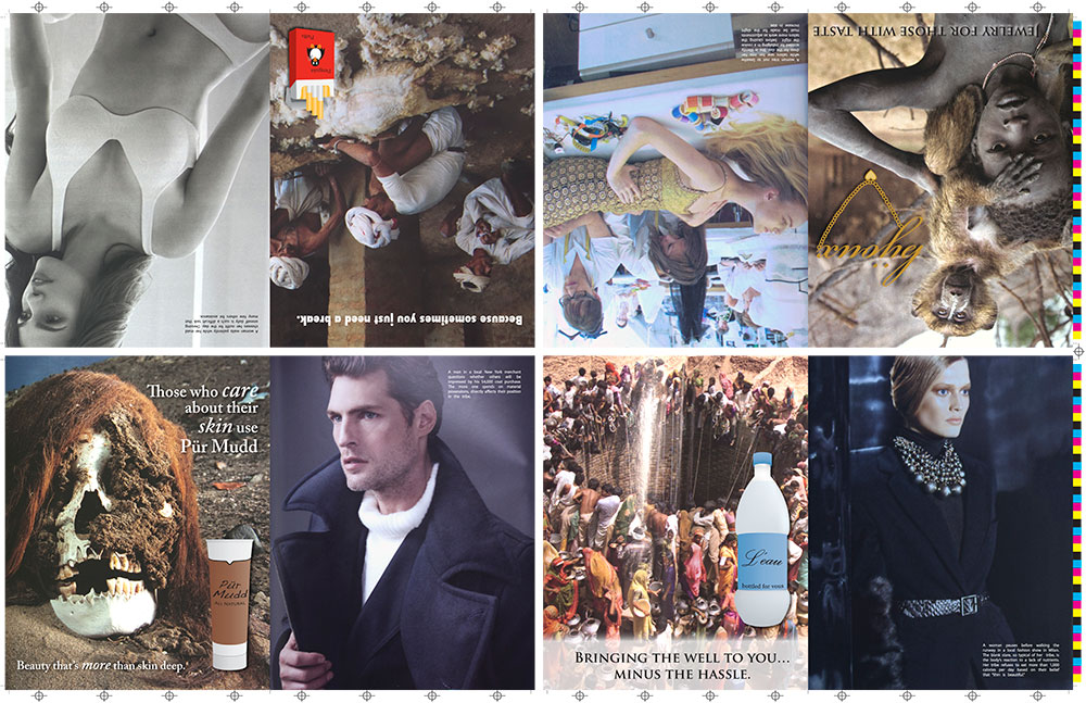
For my extended image class, we were supposed to research a photographer and then create artwork “in the style of” that photographer. I chose Barbara Kruger. She was inspirational to me because she is also a graphic designer and works with text and appropriation, which I have never done before. I had a lot of fun with it and am interested in exploring it further in the future.
My intent was to show the disparity between weath and poverty. The National Geographic photos were made to look like ads and the fashion ads were made to mimic National Geographic. Since I work in the printing industry, I made the page to look like a press sheet.