I designed a logo and business cards for a co-worker who is starting a new yoga studio. Her only instructions were to use a leaf and the colors blue, brown, and silver. After showing her a few designs, she decided to stick with blue and silver and delete the brown. While doing some research on yoga logos, I noticed that a lot of them tend to use a sans-serif font for the word “yoga.” I tried to challenge this by picking a serif font, but it really didn’t look right. I had a lot of fun working on this design because I got to try out some new ideas.
Promotional Items
ArtworkI recently finished a fun project at work. For our newsletter, we were putting a segment in there about promotional items. Since we don’t have ideal lighting conditions or nice cameras at work, I had to redraw the promotional items in Illustrator. It was fun, but tedious. And I won’t lie, I really enjoyed it!
For all of the different pieces, I had to go about drawing them in a different way. For the shirt, I used the gradient mesh tool, the water bottles were just transparencies and blocks of color, and the rest of the items were a combination of the gradient mesh tool, gradients, and transparencies.
I’m most proud of the reflector. I had no idea how I was going to make something look textured like that and not fake. After spending a long time studying the patterns, I came up with a pattern that looked realistic. Fun!
Business Card Design
DesignI recently designed the business cards above for a client at work. The larger card in the upper-left is the design that he chose. When he first chose that design, I was happy that he didn’t choose what I thought was the worst design, but I also didn’t think that he chose the best design. After talking about it with a co-worker, I realized that the designs that I liked the best were the ones that I had put the most amount of work into. I had drawn the compass in the background of the card in the upper-right and the one below it. I had also used a reference photo of birch bark in combination with an existing font to create a new font where I had drawn in the birch bark (in upper- and lower-right cards).
In the card that he chose, I had used the star tool to create the sunset and an existing “wood” font. And my least favorite designs, the ones in the lower-left and middle-right, I had used the circle and star tools in Illustrator. Not much work.
Not long after I had finished these designs, I watched this Ted Talk.
I thought it was interesting, and it gave me a new perspective on designing for other people.
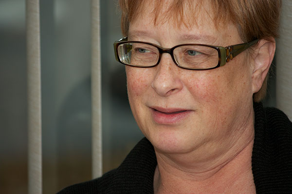
Let’s Try This Again
PhotographyNow that we have moved and are all settled into our new house, I took a look back at the last post that I wrote. And I have come to the conclusion that I really don’t like how it turned out. So I decided to post it again…minus the makeup. I think this looks more like a photo my mom could appreciate of herself. (And less like a clown. Sorry mom!) The makeup was way too much.
Photo Retouching
PhotographyIt’s been a little hectic lately with all the house showings going on. I spent more time at the library this past month than I probably have in my entire life. But in the end, it was all good, because our house has sold. Hooray!
While at the library, I borrowed the book Professional Portrait Retouching Techniques for Photographers using Photoshop. As anyone who knows me really well can tell you, I love myself a good Photoshop tutorial! And this book was full of them! The best part for me was that you could download all the images and follow along. In addition, you could download eyelash brushes and alternate images to practice on.
I have found a lot of times with tutorials that when I use their images, the results are amazing. But when I use my own images, they’re not quite as great. So I grabbed the photo of my mom above and started retouching. I think most of the retouches that I did turned out nice. But then I went to makeup and eyelashes. To me, these seem a little over the top. I’m not sure if it’s just because I have never in my life seen my mom with such full eyelashes, or if they really are just over the top. Next time, I’ll have to try using a photo of somebody I don’t know quite as well and see if it’s easier to tell when it gets too fake.


You must be logged in to post a comment.