It’s a KangaPoo!

Miscellaneous

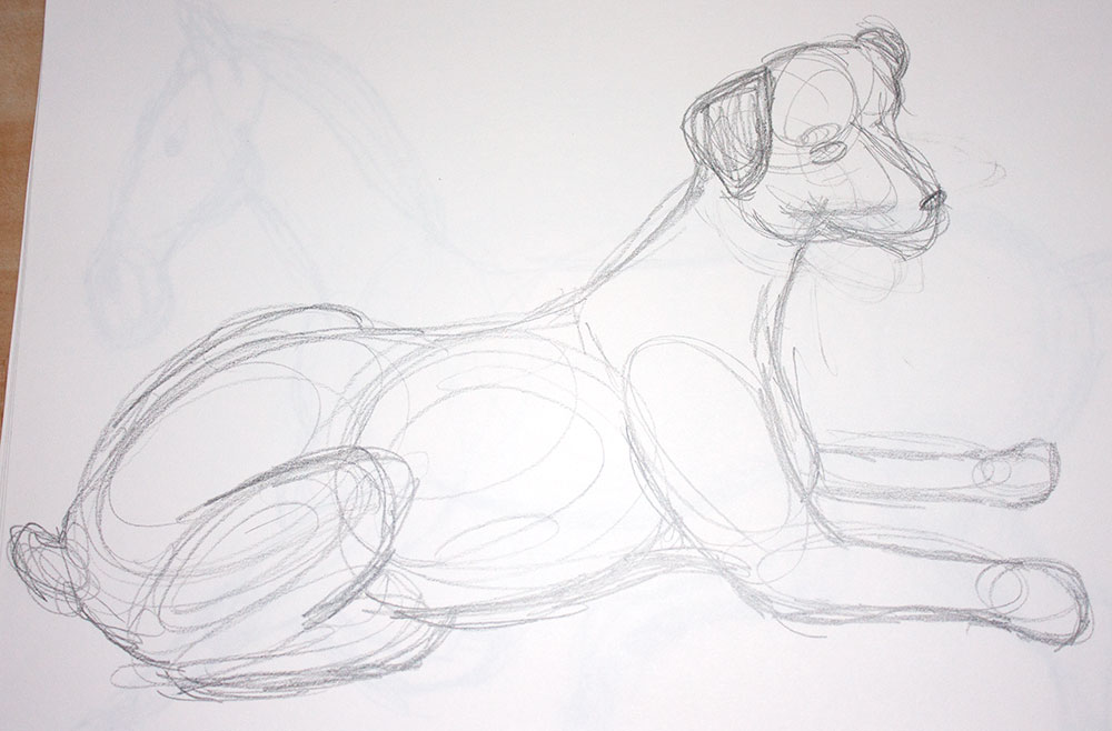
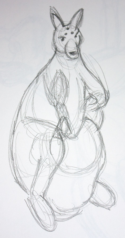
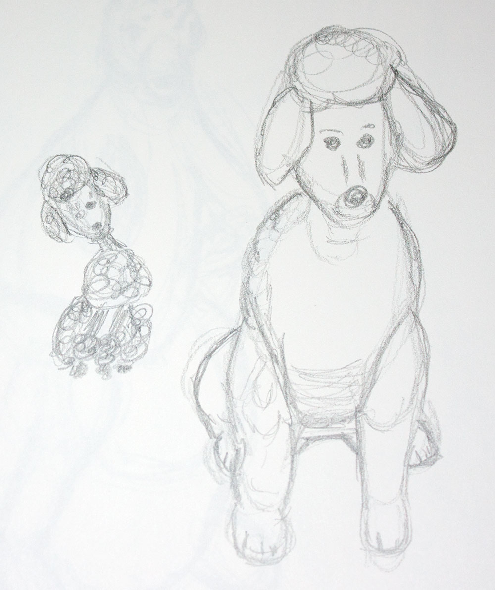
In my last pet portrait class, we had picked the figurine that we liked drawing best and sketched it out on some nicer paper. This week, we painted them with Gouache. Why a KangaPoo (you might ask)? Well, I liked the kangaroo, but her pouch looked so empty since her joey was missing. Since there was a poodle nearby that fit into the pouch nicely, it seemed like a good fit. Oh, and why not? In case you are wondering about the holes in the kangaroo’s head, she is actually a salt shaker. I could have removed the holes in my painting, but I think they made it more fun!

This was my first time painting with Gouache. I like that it can be transparent, like watercolors, but also has the ability to be opaque. Although this ability is awesome, at times it was also frustrating. The paint that I laid down was sometimes much darker than I had expected it to be. After a lot of reworking and adding water, I finally got the colors to where I wanted them. I’m guessing that, like anything, the more I do it, the easier it will get.

Back to School

Artwork

This week I started taking a painting class through MCAD’s Continuing Education program. It’s called Painting the Pet Portrait, and it’s taught by my friend, Alison. So far it’s been really fun! We had some pet portrait history and started working on gesture drawings, some of which I’ve posted below. From our gesture drawings, we had to choose one of the animals we liked best and do a drawing on Bristol. Next week, we are painting it with Gouache. I could have posted my preliminary drawing here, but I thought it would be more fun to post it once it’s been painted. Oh, and by the way, the animals that we drew were actually figurines. We did not have horses, kangaroos, etc. in the classroom. (I know, hard to believe…)

Dog Horse Kangaroo Poodles Swan

A Visit with Family

Photography

My mom was recently here for a visit. As a part of that, we took a trip to see my Grandparents with my aunt and cousin. Since I barely have any photos of my family, I thought it would be nice to bring my camera along and get some pictures. Sadly, it was a dreary and rainy trip, which meant that we were indoors, and I had to use my flash. I’ve read books about using my flash, and I understand the concepts, but in practice, it doesn’t quite work out as well as I would like it to. I was discouraged with the pictures I got. Luckily, when I got them home and onto my computer, I realized that they weren’t as bad as I had originally thought. When I attached my flash, I had forgotten to change my white balance setting. A few quick clicks in Aperture, and I’m pleased with what I got.

_MG_6444 _MG_6449 _MG_6453 _MG_6454 _MG_6456 _MG_6470 _MG_6478 _MG_6481 _MG_6485 _MG_6490

Postcard and Flyer Design

Design

A few weeks ago, I created a postcard and flyer for St. Gertrude’s. I really liked how they turned out, so I thought I would share them. The client made some tweaks, but I liked these versions best. The waterfall picture was used on a few of their previous pieces and helped to tie everything together.

st_gertrudes_flyer st_gertrudes_pcd


Logo Design

Design

My company was recently asked to update a logo design. The challenge was that the customer wanted their logo to look “digital” as well as be able to be embroidered on t-shirts. This was difficult since the two ideas are so opposite! Below is my first draft.