Last Night on Earth Miniatures

Miscellaneous
front of 4 miniature characters from Last Night on Earth

As you may already know, I like to play board games. When Nick and I first got into the hobby, one of the games we purchased was Last Night on Earth, which is a zombie apocalypse game that has miniatures. Shortly after seeing other people painting their miniatures, I decided I was going to paint ours. Sadly, we’ve had the game for years now, and I hadn’t even primed any of them!

So last year, I decided to give myself a little push by priming all of the heroes in the game. I did it in the fall, knowing that in winter, I would probably get the bug to paint, but was not going to go out in the garage in the cold and prime everything. Plus, priming works best in non-sub-zero temperatures!

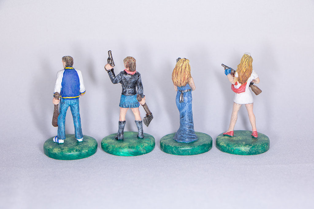
And now I have some painted miniatures to show you! So far, I only have four done. It’s been a slower process than what I thought it would be. But they are so small, that whenever I get an area looking how I want, I end up hitting the brush somewhere and having to touch things up. (After taking photos, I saw that one of them has a spot of blue in their hair that needs fixing!) But I’m getting better at it! And I purchased some magnifying glasses, which is helping, and added bonus, I look super cool wearing them (that’s sarcasm, in case it didn’t read).

Before starting, I watched a lot of videos and read painting guides. Plus, one of my co-workers, Andrew Chesney, is a really good painter, so I’ve gotten some tips from him. It’s crazy to watch him work. He can complete a couple of minis in a night, and they look awesome! I take way more time than that! But I also haven’t been doing this for years. I did try to paint one of my brother’s minis back in high school. It didn’t really work well. I didn’t understand shading or even how to paint and make something look 3D. So the mini ended up looking really flat and kind of cartoonish. Good to see that these are much better, and I’m making progress!

I started with the heroes because they will be the easier ones to paint. For me, it’s really confusing when you play a game, if the mini doesn’t look anything like the character’s photo on your character card. So I am painting the minis to match what I can see of the character’s hair color, skin color, and outfits. But for the zombies, I can do whatever I want. So I thought it would be better to get these started and make them match something, and then for the zombies, go crazy!

One thing I do wish I would have known before I primed my minis was that the minis should be cleaned up a bit. Especially with game minis like these that are more cheaply made and tend to have mold parts and other pieces that weren’t meant to be a part of the mini but ended up not being removed in manufacturing. One of the female minis looks like she’s wearing a necklace, which she could be, but I don’t see a necklace in any of the photos. So it could be a mistake. But since I had already primed it, I just went with it, and she’s now wearing a necklace.

Another difficult thing with minis that are more cheaply made is that they don’t have a lot of detail. So the dry brushing technique tends to not work the same way it would with really detailed minis. I think the faces have been the hardest part for me. I have had to redo the eyes so many times because I feel like they should be more detailed, but the eyes are so small, that just getting them to look like eyes and not make the characters look cross eyed has been hard!

I’ll post more as I get them done, but for now, this is what I have. Enjoy!

Art Show

Artwork

For a while now, I thought it would be really fun to do an art show. I’ve never had one, and an acquaintance’s husband got his art put up in a local coffee shop and had an opening party. It seemed like fun! And who doesn’t like a party? I wasn’t sure whether I would go as far to get my stuff put up somewhere public or just rearrange the garage and invite over some friends and family. But, details…those could wait. So last year, I took one day each month to devote to creating a new piece of art. My goal was to have 12 new pieces to put on display. And the event was going to take place in June.

So, about that art show… I had decided I wasn’t ready to put my stuff on display in public (I know. I’m a chicken). Nick and I usually try to do some sort of gathering at least once a year, so we decided the art show could be a part of that. And then Covid happened. And that made planning anything really difficult. Would the quarantine be over in time for the art show? If it was, would we feel comfortable having a group of people over at our house? Would other people be comfortable coming to our house? There were so many questions that didn’t have answers, so we decided it was best to just not plan at this point in time.

So maybe next year? But we’ll see. Nick and I have been rewatching The Office. After seeing the episode where Pam’s class has an art show and only a few people show up for Pam, and the other artists ridicule her stuff for not having a greater meaning behind it and just being random things she drew while at work, it’s made me rethink things. I have basically just painted a bunch of random things that I felt like painting that day. Some were photos I took that I thought would make nice paintings, and others were just random things I found on the internet that I wanted to paint. Not that there’s anything wrong with that. It’s keeping me creative and upping my skills. But is that what I want for my art show? Or do I want something that is more meaningful that I feel truly expresses a part of who I am? Or do I just say, “F*** It!” and have a show with this art, and then in a few years, have another show that is more meaningful? I’m not sure. But even if I never put on a show with what I’ve created here, I’m glad I created it, and I can see how my skills have improved.

Most of these paintings were done with Gouache. Lately that seems to be my go-to medium. I used acrylics mostly when I was younger, but in college I really got into watercolors. Gouache seems to be a good in-between medium that I had never tried until I took my friend’s (Alison Nowak: https://www.alisonnowak.com, in case you are interested in taking a class from her. She is an awesome person, as well as a great teacher!) pet portrait painting class at MCAD. And I love that I can work in tandem on 2 paintings, as well as get something else done while I wait for everything to dry. It just seems like the most productive day ever!

The Koi Fish and Japanese Waterfall painting were done digitally in Procrate. That was really fun, and I’d like to explore that more as well. But I think I have been gravitating to the non-digital realm, since I spend so much of my life in the digital realm. It’s nice to take a break and just go old school. And it’s good to deal with not being able to hit undo all the time. If I make a mistake, I’m mostly stuck with it. Especially since watercolor and gouache tend to look worse the more you go in and try to fix mistakes.

Anyway. This is what I would have put up, had I had an art show this year. I hope you enjoy!

Website Redesign

Artwork
gouache painting of a tree frog on a leaf

I finally did it…I switched my website over from a self-hosted site to a WordPress.com site. My old site needed an update…badly! The unfortunate thing that I learned from my last update, is that unless I buy a theme from the exact same developer, things will break when switching over because developers may code things differently. And learning how someone set up their new code and how to fix it to do what I wanted it to do was not interesting to me. Maybe another time, but not now. Now I want to create and post and not worry about the code. And I have had so many posts that I wanted to make, but since I was first planning and then in mid-switch, I didn’t want to take the time to post on two sites while they were simultaneously existing. And, I thought this was going to go a lot faster than what it did. So I just didn’t post.

The switch to WordPress.com was easy, but difficult. The easy part was backing everything up and porting it over. The difficult part was deciding which pricing tier to pay for and which theme to get. I was torn. One thing that drives me crazy about the new site is how it says, “Home” on the front page. But…I have to upgrade to the next tier in order to be able to get rid of that. Is it worth it to pay $4 extra per month on a website I don’t make any money off of, just to get rid of this ugliness? I wish I could tell you it was a no-brainer, and I quickly got over it. But it really bugged me! Eventually, my voice of reason won out, and I reminded myself that it isn’t as important what the site looks like. The content is what’s really important. Of course, if it looked like a site from the 90s, that would not be ok. But the WordPress free themes are ok for the most part, and I’m pleased with the overall look. And, all the other stuff that I really don’t like, I’m learning to deal with it. Because it’s not just the word “Home” that I don’t like…

I chose this specific theme because it takes advantage of the Portfolio feature in WordPress. I’m hoping that eventually more themes will use this feature, and when I need to update the site again, it will seamlessly switch. But we’ll see. Who knows? When I need to update again, maybe I’ll be all fired up to code again, and I’ll head back to self-hosting. You never know.

Wow! I just checked, and my last post was September of 2019! That was awhile ago. You may think that I haven’t been doing anything, and that’s why I haven’t posted, but that’s not true. I’ve been trying to spend at least one day per month creating art. For awhile I was doing a lot of gouache paintings. Then I moved on to painting some miniatures. I tried some digital painting as well. And work has been really busy. I’ve been working on some booth designing and learning 3D, which has been a challenge, but fun. And my newest endeavor has been learning to play the guitar! I’ve only been at it for about 2 months now, and I still sound horrible! But I am getting better. That’s good news for Nick, who sometimes hears me practicing!

The painting above is a gouache painting I did of a tree frog photo that I found online. It’s the most recent painting that I did, so I thought I would share it now.

I’m going to wrap this up now, but I’ll be back soon to share some of the stuff I’ve been doing and keep you updated with anything new I’ve gone on to! I hope you have all been well and are keeping yourselves safe.

Cloudspire

Design

For about a year, I was working on the board game Cloudspire at work. It’s complete, and the staff just got their copies recently! Not only is this the first big game that I’ve worked on with the company, it’s also the first game where I’ve been involved right at the beginning. It has been a good learning project and a lot of fun! And to date, it’s my best work yet!

It was a completely different experience to be involved in the game from the very beginning. When I worked on Too Many Bones, there was already a design aesthetic set up, and I had to make sure that everything I did matched up with what was already in place. With Cloudspire, I had a part in shaping how the game would end up looking, which was very rewarding, but also very challenging.

The most difficult part is getting everything to fit on a chip and be legible. Every chip has at least nine different pieces of information on it. And because the main artist, Anthony LeTourneau does such a great job on the art, we try our best to keep it as large as it can possibly be. But since playing the game is the most important part, every symbol and piece of game information needs to also be clear and legible.

This was also the first project that I managed multiple artists. In addition to Anthony, we also had Jared Blando working on all of the neoprene hex art. His art is beautiful and bright and vibrant. The biggest challenge was making sure that both of the artists’ work looked coherent and seamlessly fit together. Since their styles are different, it was not the easiest task. But I think it also helped that the only place where their art was merged was on the neoprene fortresses.

My favorite pieces are the covers for the solo and cooperative scenario books. They were some of the last designs that I did for the game, and I love how the scratches worked with the background art. It added a grunge that gives you an idea of what is back there, but really calls more attention to the art and makes it stand out. The only thing that makes me sad is that the covers were printed so dark. (You can’t tell this in the photos because I lightened them to look as I had intended.)

I liked the cover art so much, that I used the same effects when I designed the booth panels. (I’ll write a separate design post for that at another time.)

This was by far the most difficult game for me to photograph. There are so many pieces to the game, I couldn’t get a photo of everything without the edges of my photo setup showing up (which is why I have a lot of detail shots below). Plus, we went with a matte finish on the chips this time, which is absolutely beautiful, but has to be photographed at specific angles in order to not cause a huge glare!

Now the only thing left is for me to learn how to play the game! We were so busy putting together all of the content that went into this game, that I never had a chance to playtest. And since I’ll be explaining the game at Essen this year, it would be helpful to know the intricacies of it!

A New Skirt

Miscellaneous

Last year, I bought some new fabric to make myself a classy pencil skirt. I don’t know that I’ve ever owned a pencil skirt, so I was excited to add one to my collection. Since I planned on wearing it in colder weather, I also decided to line it, which proved to be pretty difficult!

I got the fabric from S.R. Harris, and I love it! It’s recycled, so it’s a little different from anything I’ve worked with before, but it’s nice because it’s hefty and looks classy.

I didn’t have a regular pattern for this skirt. I used the book Flirt Skirts to draft one by measuring out the pattern in the back of the book and recreating it on a large sheet of paper. The original size that I drafted wasn’t fitting right, so I put it on inside out and did some alterations. In my altering, I tapered the skirt in a little more near the hem, since the shape looked more pleasing. I didn’t realize until wearing the skirt to work one day, that my tapering was too much, and I now have to unzip the skirt to use the bathroom, since I can’t bring it up over my hips! Oops!

As I mentioned above, the lining was difficult for me. I’ve never lined anything before, and the book didn’t have instructions for it. So I searched the internet, watched some YouTube videos, and got started creating the lining. I’m not exactly sure what I did wrong, but the lining is much smaller than the skirt. So it’s a little tight in some areas that would not be tight if it were just the skirt. I also had a hard time making the waistband of the skirt because the lining was so slippery. I put the skirt on and folded the waistband, since that seemed to be the easiest way for me to figure out how to get it to work. But that caused its own problems, and now the zipper is not lined up correctly. But on the good side, the skirt feels pretty hefty, and the lining is nice.

If I were to make this skirt again, I would also have added a kickpleat. Not having one makes it difficult to get in and out of the car. And I’m a tall person and take large steps, and without a kickpleat, I feel like I’m being restricted to walking slowly, which I don’t love.

So, overall, I’m pleased with the skirt. As long as I wear a longer shirt to cover up the zipper, it looks nice and is a great new piece for my wardrobe!